LewAllen Digest, No. 1: Color
Welcome to the first issue of the LewAllen Digest, a letter from the gallery to the company of readers who have lived for years with the work of our artists, and to those whose looking has just begun. The Digest is not a catalogue, nor a calendar of openings (you receive those already), nor a press release dressed for evening. It is closer to a conversation we might have if you walked into our gallery in Santa Fe on a Tuesday afternoon and asked what we had been thinking about lately. Each issue takes a single subject—this one is color—and follows it across the gallery program, into the museums where related conversations are unfolding, and back through the writers and painters who have thought hardest about it. We assume a reader who is busy, curious, and unintimidated; who wants the substance without the seminar; and who suspects, rightly, that learning to look at art well is among the more remunerative uses of an intelligent hour.
The Retina Reconsidered
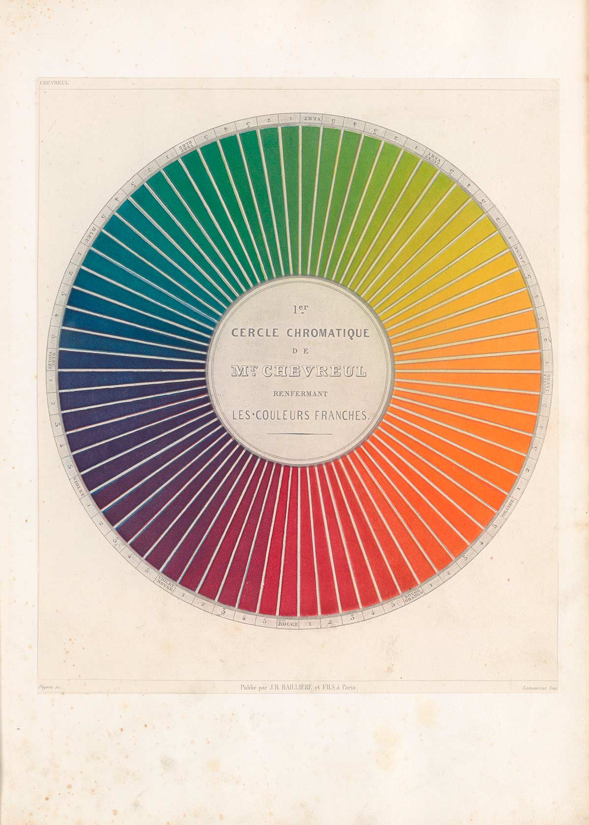
Color is the part of vision we trust most and understand least. For most of the twentieth century, painters worked from an orthodoxy held to be conclusive. Michel-Eugène Chevreul, the nineteenth-century French chemist hired to deduce why the dyes at the Gobelins tapestry works were producing unforeseen optical surprises, published his findings as a circular diagram of complementary hues: the cercle chromatique, ancestor of every color wheel that has hung in an art classroom since. Chevreul gave the nineteenth century its laws of simultaneous contrast, the rule that a hue shifts in the presence of its neighbors. The Neo-Impressionists (Seurat, Signac, and the painters who composed their canvases out of small adjacent dots of pure pigment) put the rule to work on canvas, leaving the mixing to the eye.
By the time the Bauhaus-trained artist Josef Albers published Interaction of Color in 1963, the associated science of color perception had acquired the authority of settled fact. The retina was understood to hold three cone types, each tuned to a different band of the visible spectrum, and every color a viewer perceived resulted from the brain's interpolation among these three channels. While Albers's book was not a scientific treatise, it built on this foundation. Through hundreds of paired studies, he showed that a single swatch of pigment reads as two different colors depending on the field around it, and he turned this demonstration into a teachable method that has shaped studio art education on both sides of the Atlantic ever since. Interaction has never gone out of print. Together, Chevreul, the Neo-Impressionists, and Albers had formed a working description of how human color vision operates within the bounds of the visible spectrum. Last April, a laboratory in Berkeley showed that those confines were anything but comprehensive. Reporting in Science Advances, the team described a precision laser system, named Oz after the Emerald City, capable of firing individual cone cells in the living human retina. They produced a color the eye has never met in nature. They named it olo. Five subjects saw it. They described a saturated blue-green of impossible intensity and reached for the exhausted vocabulary of people trying to name a smell. One called it the most saturated thing he could imagine. Another laughed and stopped speaking.
Oz arrives on top of an older finding, by now firmly measured: roughly twelve percent of women carry a fourth retinal cone. Tetrachromacy, as the condition is called, grants its bearers something like a hundred million distinguishable shades, against the rest of us at one million. If color is not a single public fact but a range of private ones, then any two viewers in front of the same canvas are looking at slightly different paintings, and the agreement they reach about what they see is closer to translation than to perception. Sonia Delaunay, the Russian-born painter who with her husband Robert founded the prewar Parisian movement they called Simultanism, a conceptual project that regarded overlapping colors as the engines of pictorial velocity, wrote in her seventies that color is the skin of the world. She meant it as metaphor. The laboratory is refiguring it to be literal. Sight, it turns out, varies no less than skin. No doubt the artist John Little, whose lavish color extravaganzas have recently graced our gallery walls, made adept use of his color wheel. His work is considered at the end of this letter.
Raphael's Pinks Restored
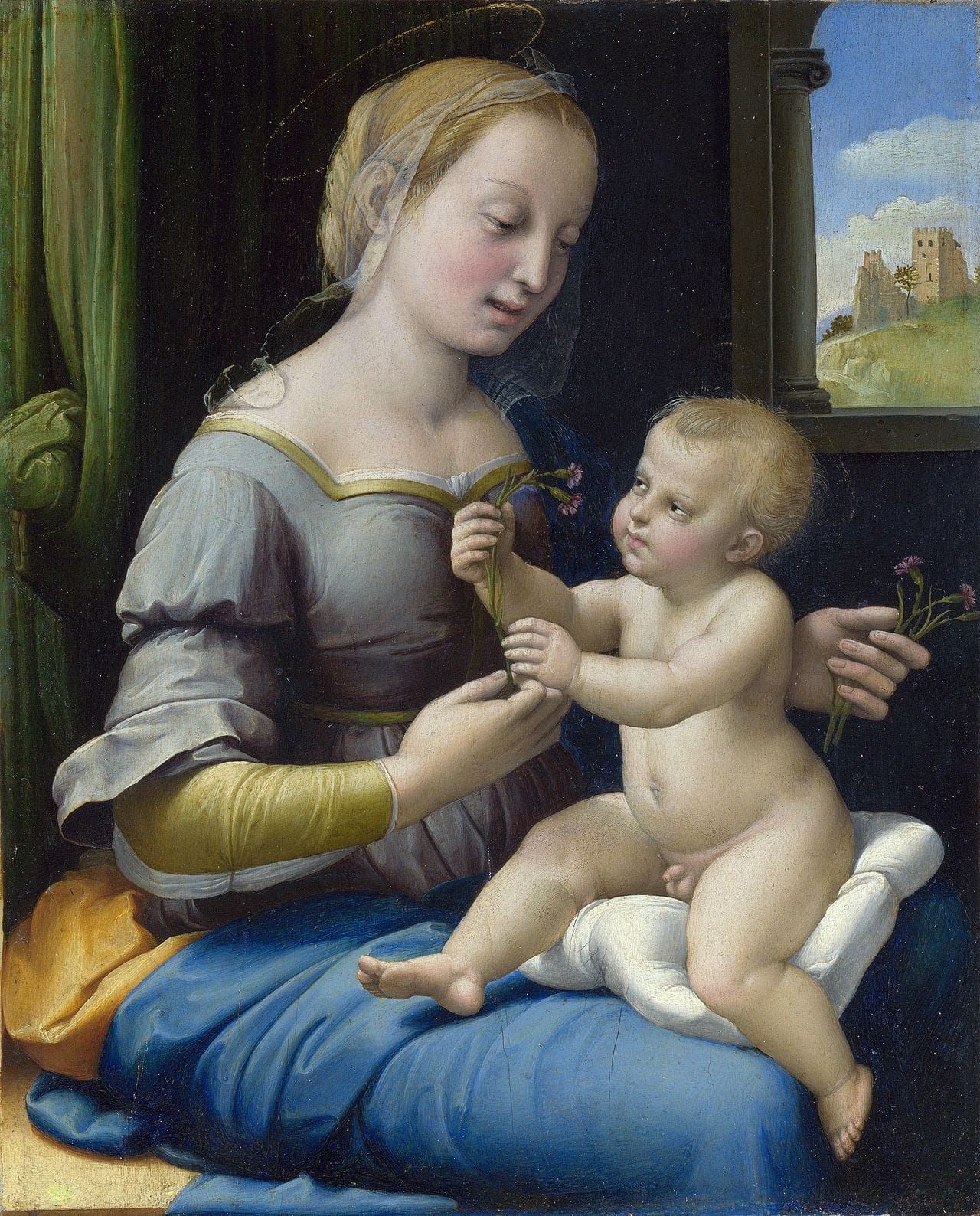
Raphael: Sublime Poetry, on view at the Metropolitan Museum this past spring, was the first comprehensive Raphael exhibition the United States has hosted. It gathers more than two hundred works from collections in Europe and America, the great preparatory drawings for the Vatican frescoes among them, and, on loan from London's National Gallery, a small panel that bears on the subject of this LewAllen Digest letter. The Madonna of the Pinks has just come out of conservation. It is no longer the picture the reproductions describe. Stripped of nineteenth-century varnish, the panel shows a chromatic register that startled the conservators themselves: a high cool rose against eggshell and slate, the small flowers the Virgin and Child are exchanging glowing with a freshness Raphael's Roman patrons would have known and the Victorian connoisseurs who built his modern reputation never experienced. Garofani in Italian, carnations in English, they were a traditional emblem of betrothal and Christ's Passion at once, and the panel was painted for private devotion, almost certainly for a young married couple. It is small enough to be held in one hand.
Most of what gets called Old Master color is the sepia of the intervening centuries. Varnish yellows. Egg tempera, the medieval medium of pigment bound in egg yolk, darkens. Candle smoke deposits a pale film that, given a century or two, the eye stops registering as a film at all. The nineteenth-century restorers preferred their Madonnas a touch melancholic and corrected toward this predilection. Strip the layers and the picture beneath is younger: quicker, more chromatically assertive, less weighted with the gravity later centuries conferred.
The pink is doing the work the drawing usually enacts, and this from a painter whose draftsmanship, on the evidence of the sheets hung around the panel at the Met, was as fully formed at twenty-nine as anything in the Italian Renaissance. The German poet Rilke, returning day after day in the autumn of 1907 to the Cézanne memorial room at the Salon d'Automne, wrote home to his wife Clara: “For a long time nothing, and then suddenly one has the right eyes.” The Madonna of the Pinks is the kind of picture the right eyes are discovering anew, under the varnish, after a wait of two hundred years.
Price of Blue

Italian patrons in the fifteenth century wrote contracts that itemized pigment cost by the ounce. Vermilion was extravagantly expensive. Verdigris was cheap. Ultramarine, the deep saturated blue ground from lapis lazuli, a semiprecious stone that for most of European history came from one remote mountain valley in what is now northeastern Afghanistan, cost more by weight than gold. The contracts named the figure who would wear the precious color, almost always the Virgin, and capped the painter's allowance. The French medievalist Michel Pastoureau, a leading historian of color, has argued that blue was a marginal and even suspect hue in medieval Europe until the Church reassigned it to the Virgin's mantle, after which it climbed to the top of the symbolic order. Color, in Pastoureau's account, is a cultural value before it is an optical one.
For four hundred years the painter who needed a saturated blue had to pay dearly. That changed in 1828, when a chemist named Jean-Baptiste Guimet won a prize from the Société d'Encouragement pour l'Industrie Nationale for synthesizing ultramarine in the laboratory. French ultramarine, as the new pigment was called, broke the Afghan monopoly inside a generation and made saturated blue, for the first time, accessible. A century and change later, the French postwar artist Yves Klein patented in 1960 his own intensified version, calling it International Klein Blue. He poured it onto monochrome canvases, pressed it onto sponges. He coated bare female models and pulled them across paper as living brushes, with an orchestra playing his Monotone Symphony (twenty minutes of a single sustained chord!) in the next room. “Blue has no dimensions,” Klein declared. “It is beyond dimensions.” Klein's metaphysics are his own, but the physics beneath them hold up. Blue light scatters in the earth's atmosphere more than any other visible wavelength, a phenomenon called Rayleigh scattering after the nineteenth-century physicist who first described it. This is the reason the sky is blue, the reason distant mountains in, say, a painting by David Ligare read blue, the reason blue is the color of pure space and pure air, the one hue in the spectrum often unaffixed to a surface of its own. Klein, painting his monochromes in the 1960s, had arrived at the optics by intuition. The shiver you get from a saturated blue picture—such as a Woody Gwyn seascape or a Forrest Moses painting of sylvan waters—is the eye registering, at arm's length, a wavelength it has spent its evolutionary life associating with the horizon.
A Modern Scandal
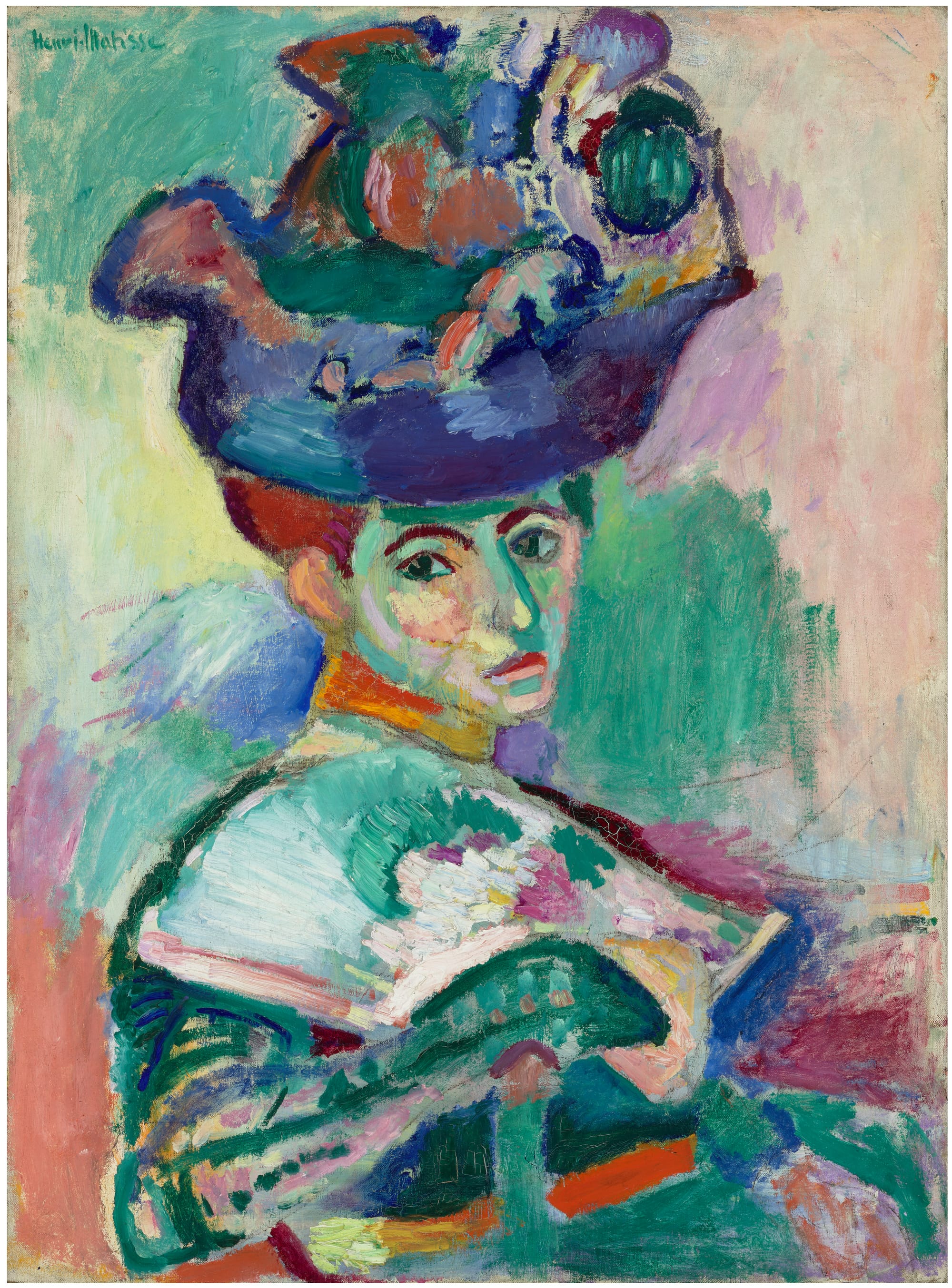
Matisse's Femme au chapeau: A Modern Scandal opened at the San Francisco Museum of Modern Art in May and is on view through September 13, 2026. The exhibition is built around a single picture and the clamor it incited when it was first seen. The picture is Henri Matisse's portrait of his wife Amélie, painted in the late summer of 1905 in the Mediterranean village of Collioure and shown that October at the Salon d'Automne. Amélie sits in three-quarter profile in a vast feathered hat. Her face is green where it should be cream, violet where it should be shadow, sulfur yellow where there should be flesh. The brushwork is plain, almost rude. The critic Louis Vauxcelles, walking through the gallery and noticing a small Donatello-like sculpture marooned among canvases of this kind, wrote that it was “Donatello among the wild beasts,” Donatello parmi les fauves. The label stuck. Fauvism had its first painting and its first scandal in the same week.
What SFMOMA has set out to recover is the original temperature of the room. The show, organized by the museum's chief curator Janet Bishop and Maria Castro with Alison Guh, gathers Matisse's Collioure paintings, the canvases of André Derain, Maurice de Vlaminck, and Henri Manguin (the painters who summered with Matisse in the south and exhibited beside him that fall) that hung at the Salon as the rest of the fauve outrage, Derain's portrait of Matisse himself made the same season, and a smaller contemporary coda that includes Richard Diebenkorn, among others. The catalogue reproduces the conservation imaging that has lately let us see how Matisse constructed the image: a thin underdrawing, then the broad chromatic decisions made fast, revised faster, the green stripe down Amélie's nose laid in over a passage that had been ordinary skin tone an hour before. Gertrude Stein, the American expatriate whose Saturday-evening salon at 27 rue de Fleurus was something of an unofficial admissions office for the Paris avant-garde from 1905 to 1938, bought the painting for 500 francs after watching strangers ridicule it. Amélie outlived the scandal by decades and, looking back on it, offered the line the SFMOMA curators have understandably been quoting: “I am in my element when the house burns down.”
Restaging a scandal is a way of finding out what the scandal was actually about. In Matisse's case the scandal was about color, and almost nothing else. The drawing itself is ordinary. The pose is the pose of a thousand other bourgeois wives in a thousand other portraits salon-strollers had already seen. What sent the Salon into a fury was the green stripe down Amélie's nose, Matisse's refusal to paint a face the color of faces. After one small act of disobedience, a century of painters took their permission, and what was once a scandal became part of a convention.
Color, Currently: The Gallery This Season
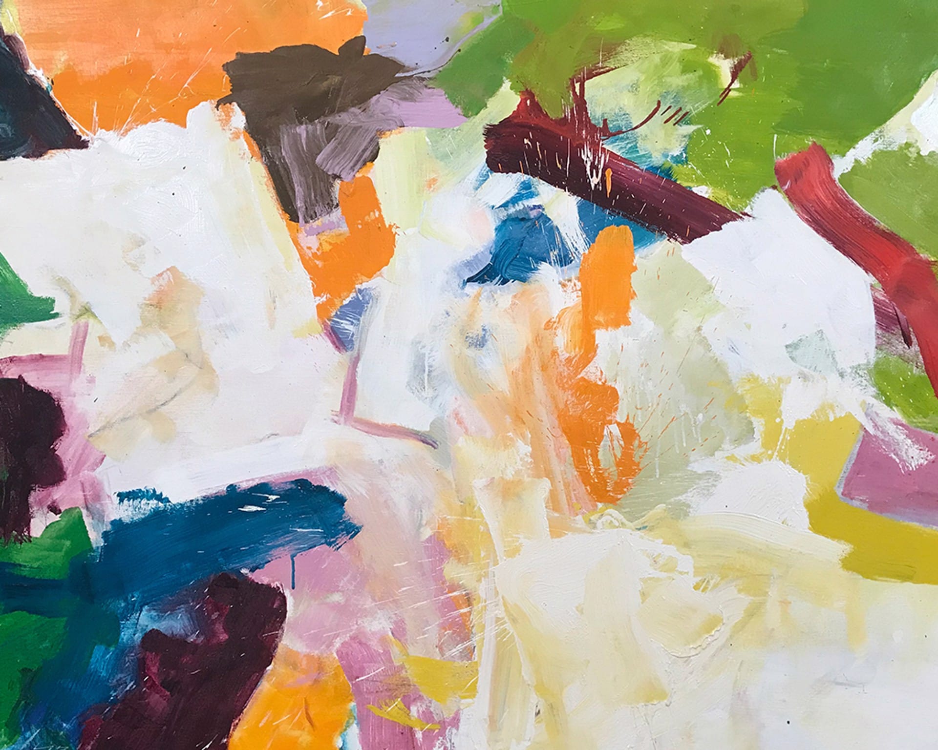
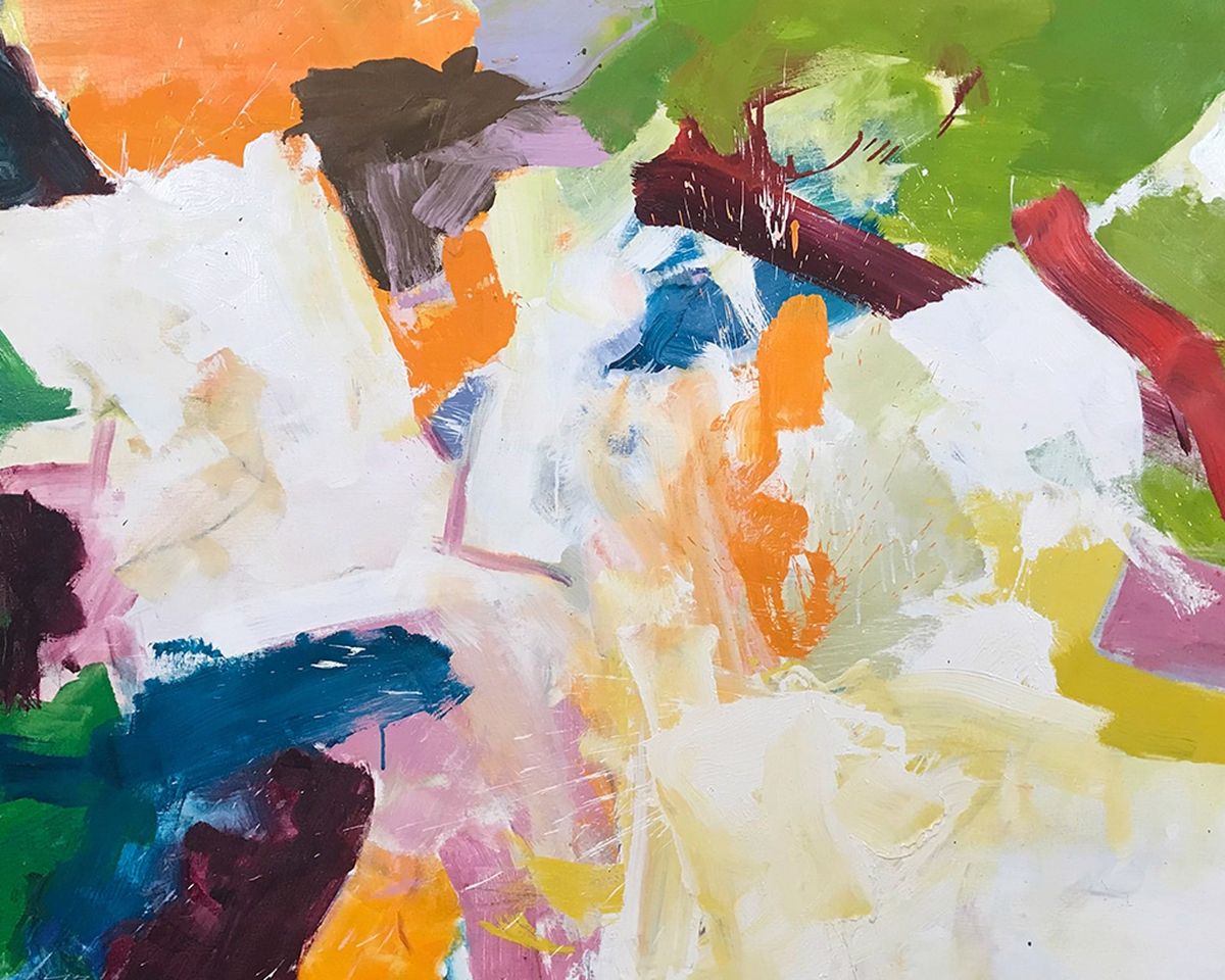
John Little: Color Says it All was on view throughout July at LewAllen. It gathered four decades of work by an Abstract Expressionist who exhibited his work together with Jackson Pollock at Guild Hall in 1955 and whose biography reads like a census of the New York School at its height: neighbor to Lee Krasner and Pollock on the East End of Long Island, student of Hans Hofmann in New York and Provincetown, recipient of a solo exhibition at the Betty Parsons Gallery in 1948, and in 1957 co-founder of the Signa Gallery in East Hampton, the first commercial space on the South Fork devoted to living abstract art. Little (1907–1984) came to painting from textile design, a recurring partner to innovations in color— Chevreul worked out his laws of simultaneous contrast at the Gobelins, and Josef Albers’s own color theory developed alongside his wife Anni’s experiments at the Bauhaus loom—and the experience gave him a feel for adjacencies, for the alchemical event that occurs when one hue is laid flush against another without the mediation of drawing. Helen Harrison, writing in the New York Times in 1981, observed that perhaps no living artist embodied Hofmann's color theories as fully as Little did. A recent wave of scholarship, much of it anchored in renewed attention to his chromatic insights, has further affirmed Little’s position in the pantheon of Abstract Expressionism artists.
— The Editors, LewAllen Galleries